
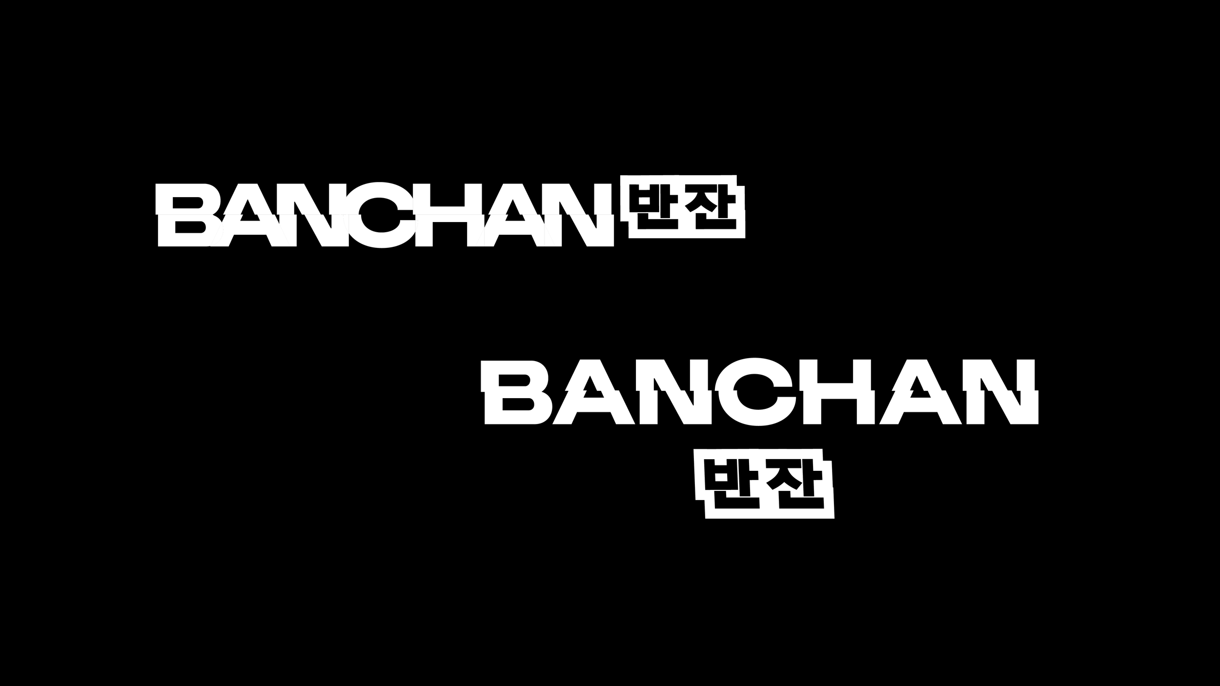
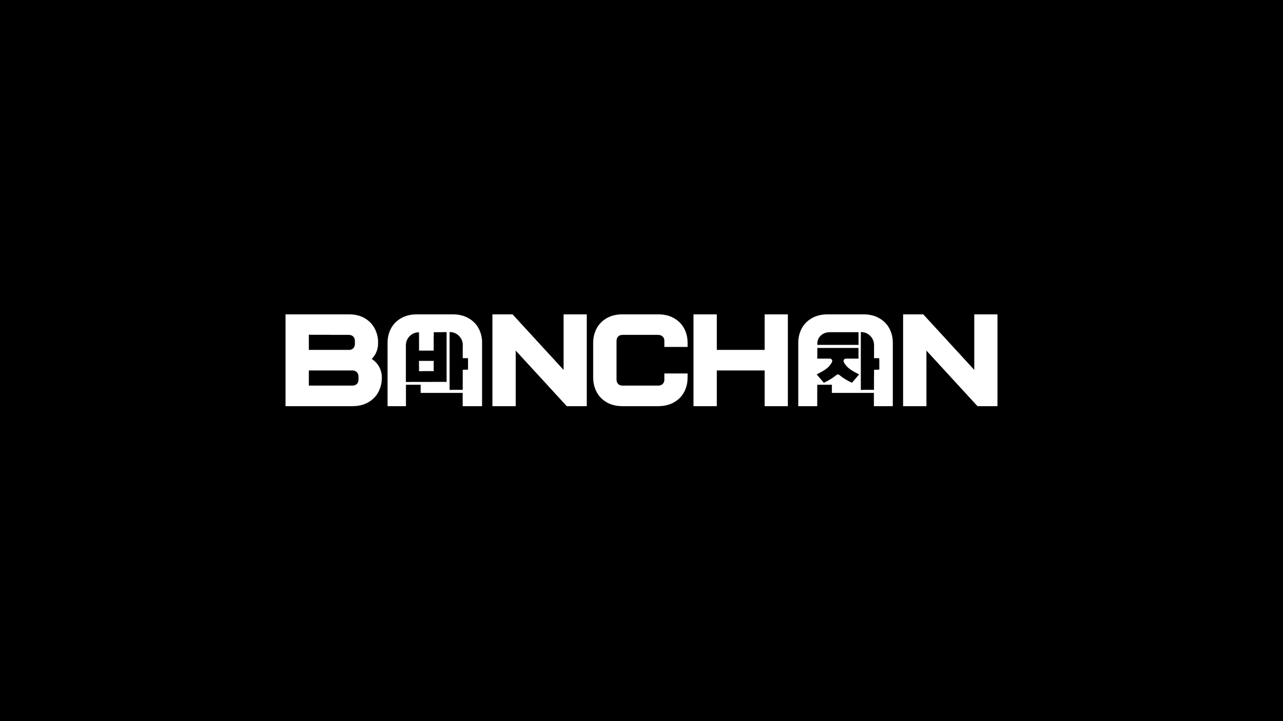
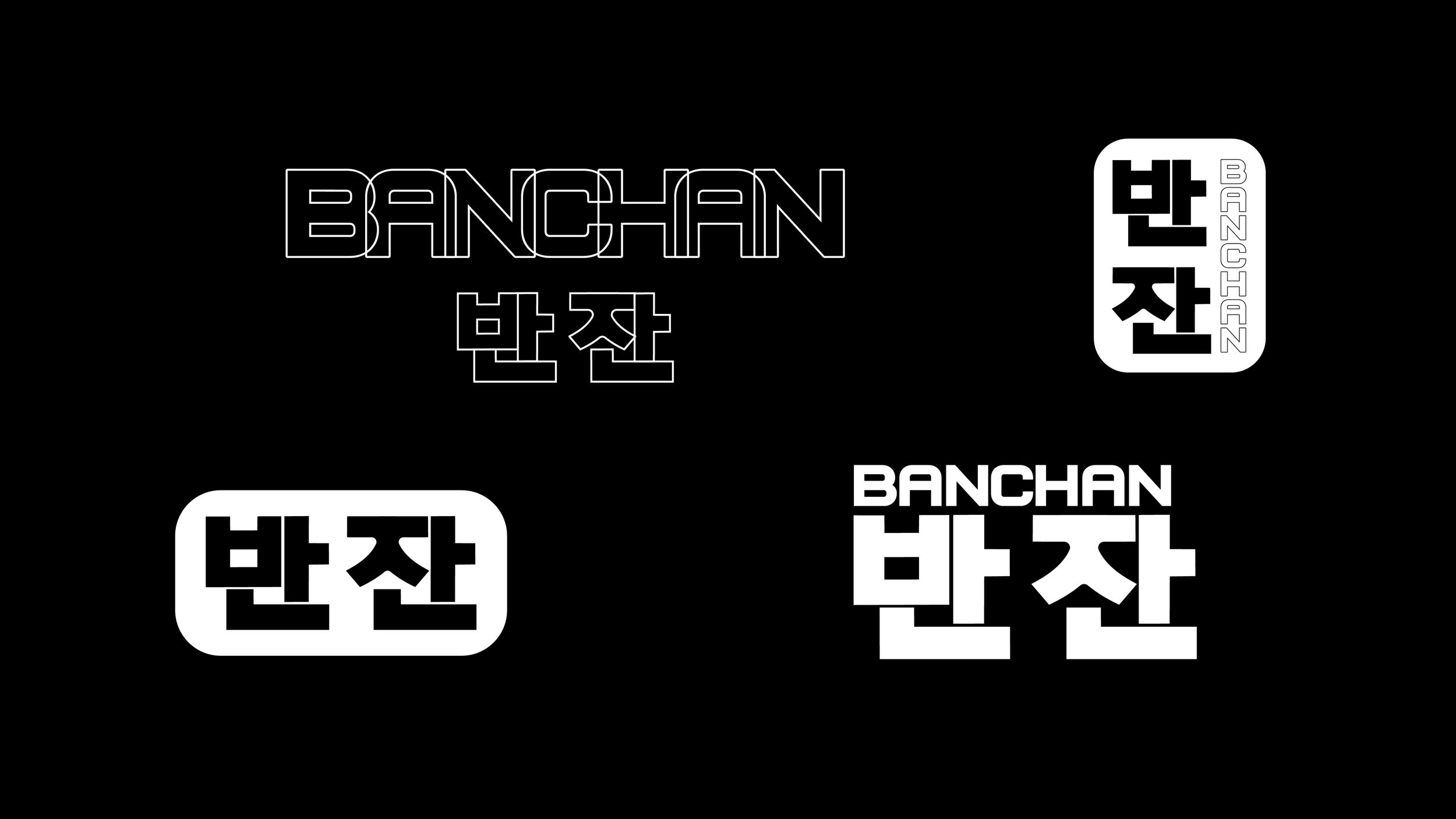
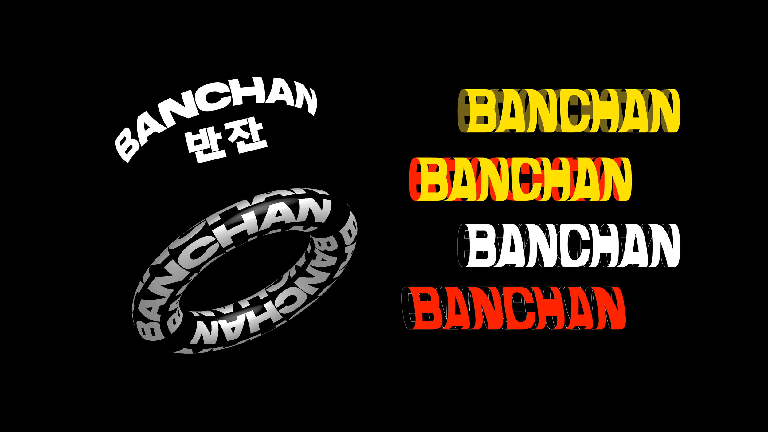
banchan logo
banchan means “side dish” in korean. banchan is also a producer and dj that makes tasty analogue synthy house-adjacent music. I can’t quite define his genre-blending style because his music is pretty much exactly what his name means, it’s got a variety of flavor so you get a little bit of everything when you listen. it’s bouncy but not too much. sophisticated but not too stuffy. anyways, the goal was for this to come through in his logo.. which came with a korean version thank you very much yes I am proud of myself for creating a logo in two languages.
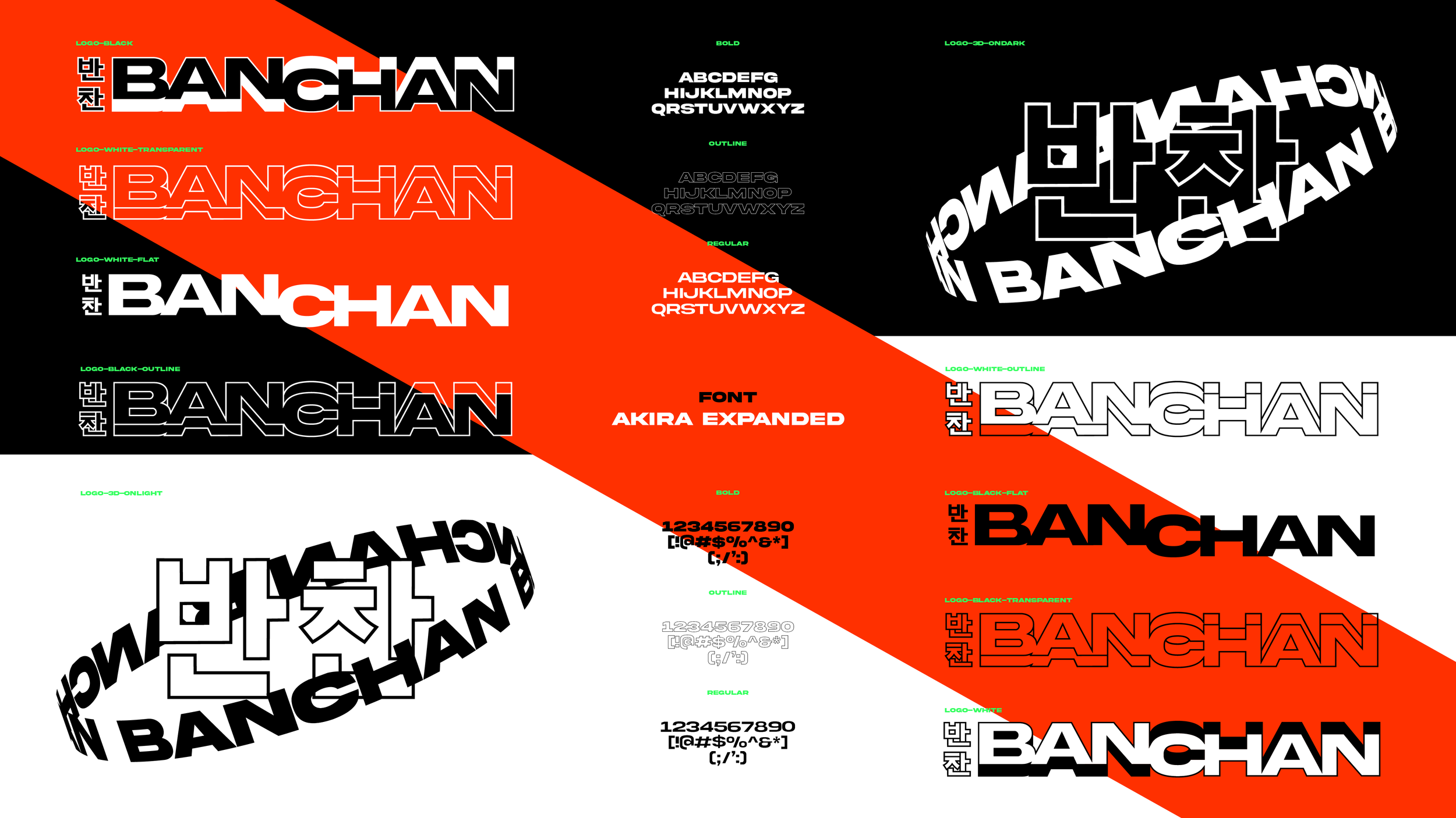
Design exploration Below
asa dental logo
a friend of mine opened her own dental practice with a welcoming and friendly environment. i drew this mark, shaping an A into a tooth, and sneaking in a little heart as its apex to nod to her kindness that she shares with every client..


BENTLEY DEAN LOGOTYPE & ALBUM ARTWORK
mau5trap artist Bentley Dean is an electronic music producer and audio engineer whose unique style is dark, industrial, and techy. This custom type treatment and accompanying artwork reflect the essence of his music and stage presence.


danél logo
A singer with a quill tattoo, Danél came to me with a need to express her authentically breathy, raspy voice, style, and personality through a logo. We worked together to create a design that she felt represented her wholeheartedly.


ignite physical therapy & sports performance branding


logo exploration


sarah’s outdoor adventures logo & illustration
Sarah started a little walking club that grew bigger than she’d ever imagined, so she quit her day job and hit the road - literally. She’s now a Florida-based travel and outdoor activity content creator. I was along for the ride, designing her many evolutions, which she specifically requested be of the utmost kitsch (I hope that’s obvious).
sarah’s walking club LOGO

holiday VERSION


additional illustrations


STAYCATIONS BY SARAH LOGO

Sarah’s Kayaking Club LOGO

milkpep type treatment
For a MilkPEP (yes, the Got Milk? people) holiday campaign, the intention was to share the feeling of the holiday season by passing along a glass of milk to people of all kinds.
To show emotion through copy, I created custom type treatments to live over photography from the holiday shoot.
I’m vegan and the only reason this is still in here is so I can tell you that I took a few calligraphy courses with vichcraft and it became my whole personality for a while.


pataday logo & packaging design
Pataday is an Rx allergy eye drop that shifted to OTC. Their goal was to appear premium and stand out amongst the craziness of the eye care section in drug stores.
How I did this: Thin logotype embedded with a respective allergen-representative icon. White packaging to stand out next to the surrounding bold-colored eye care packaging. Metallic finish for a more premium aesthetic.
For the eye drops, I used a droplet in the logo, and green to represent allergens. The extra strength drops feature a bold red.
For the nasal spray product, I used three dots in the logo, and a blue accent to represent liquid.

