

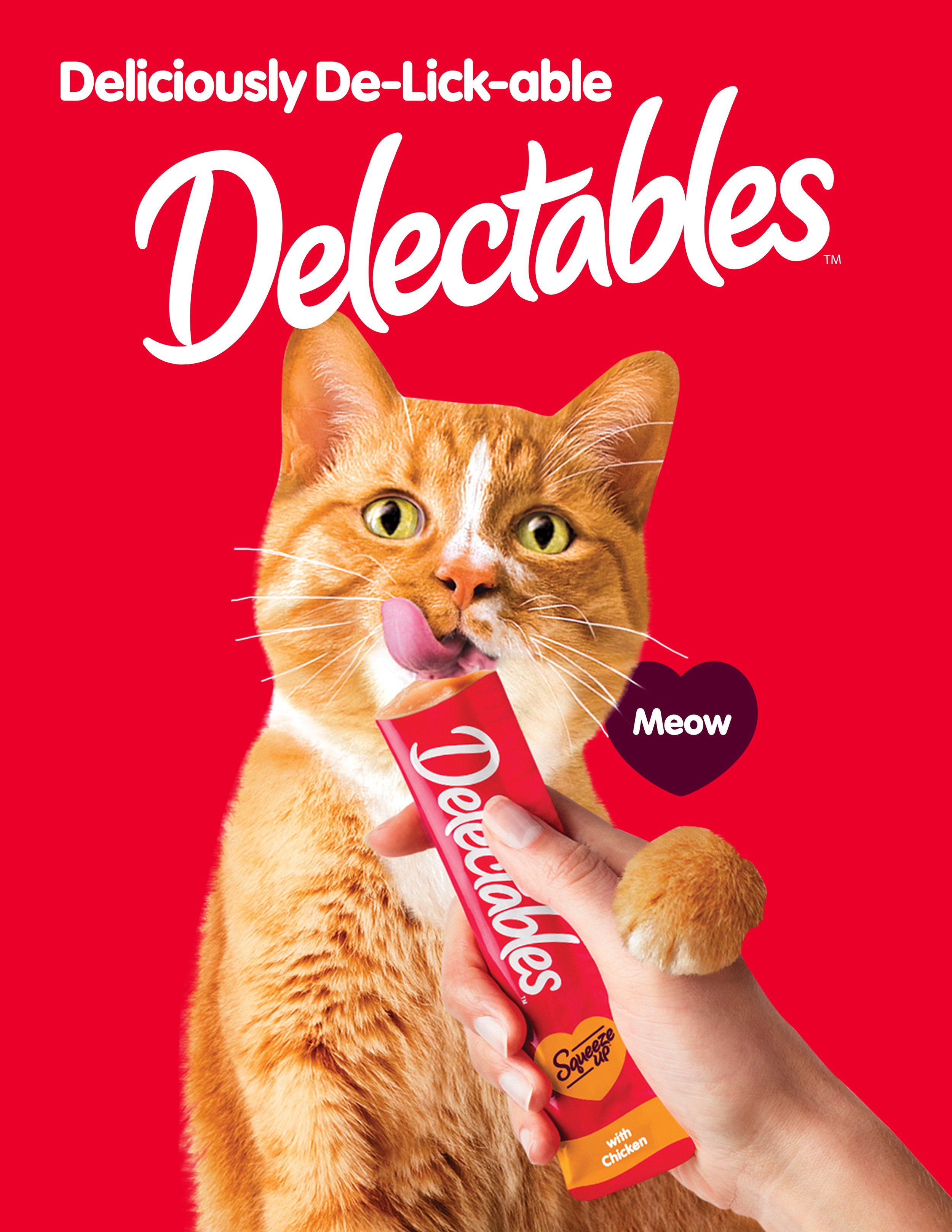
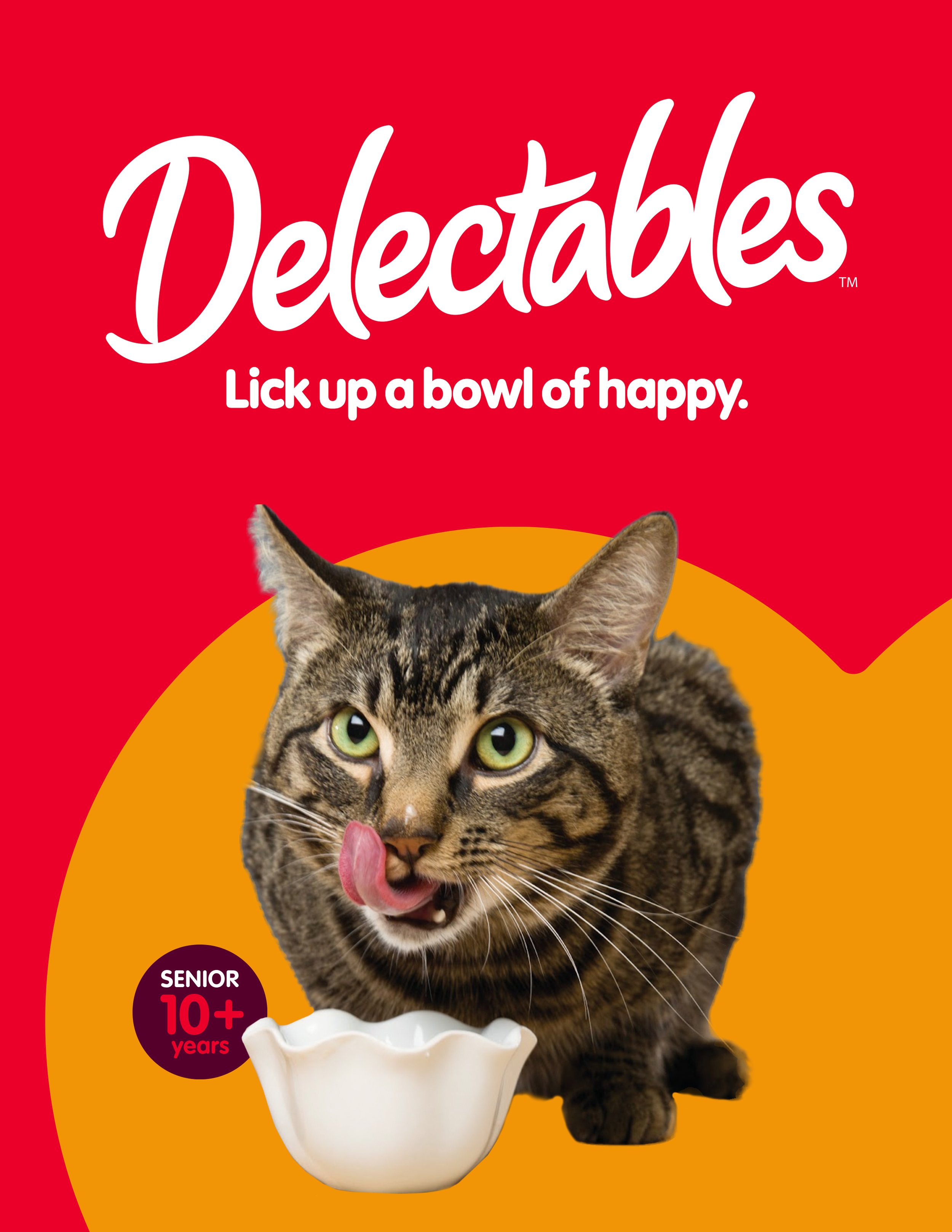
Deliciously De-Lick-able Delectables
Campaign & VISUAL IDENTITY
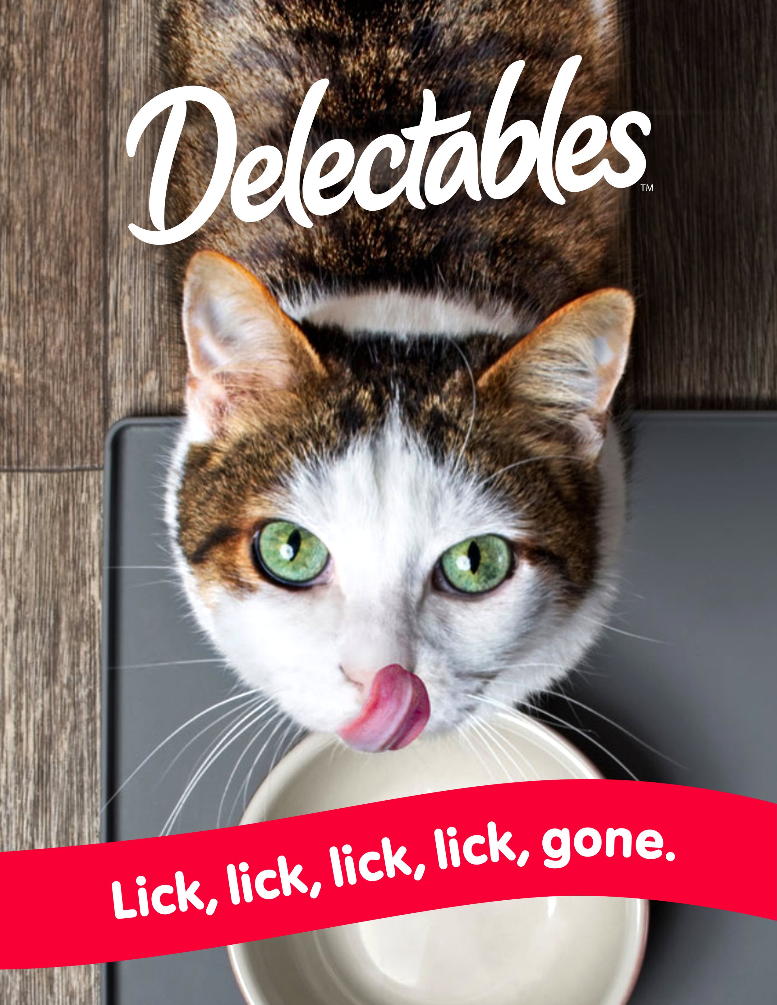
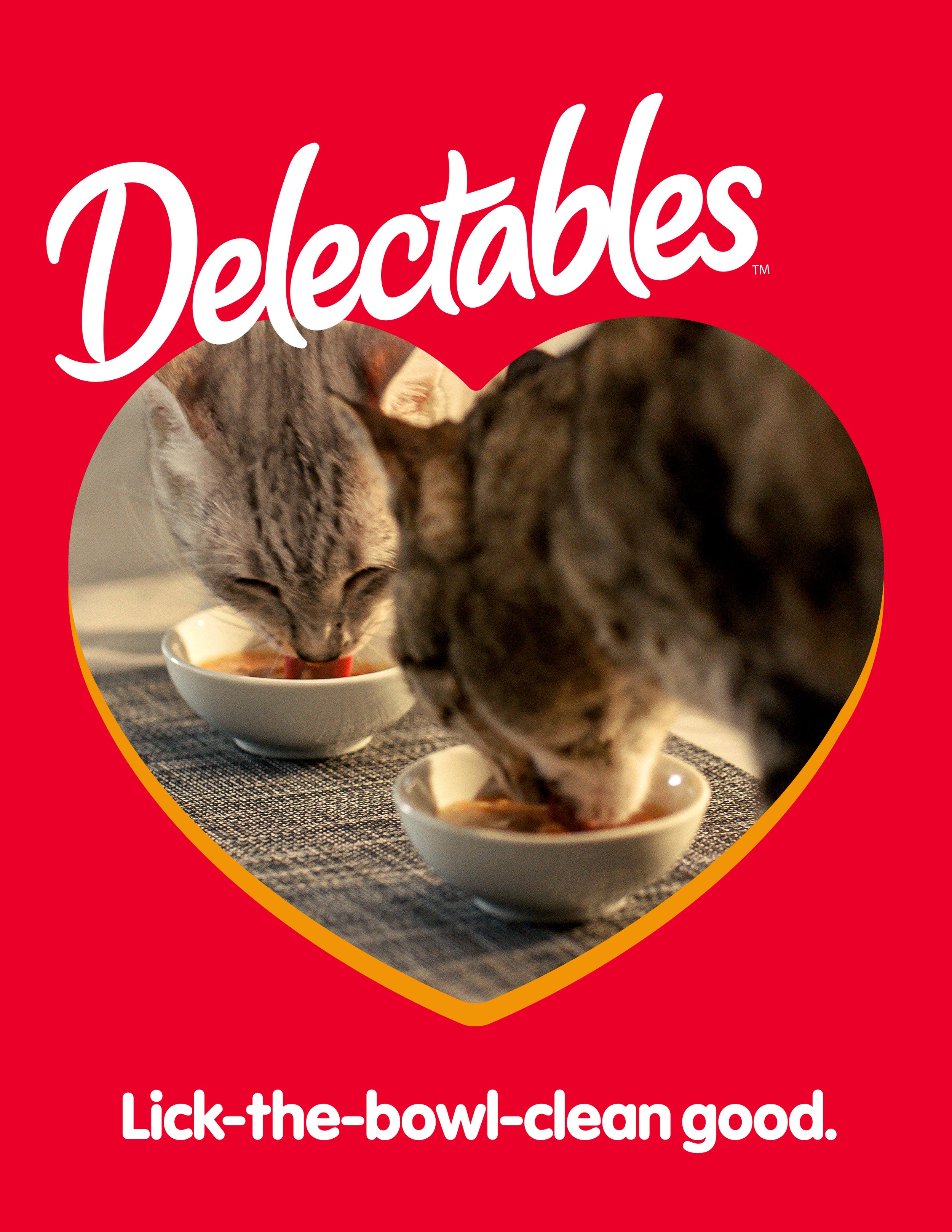
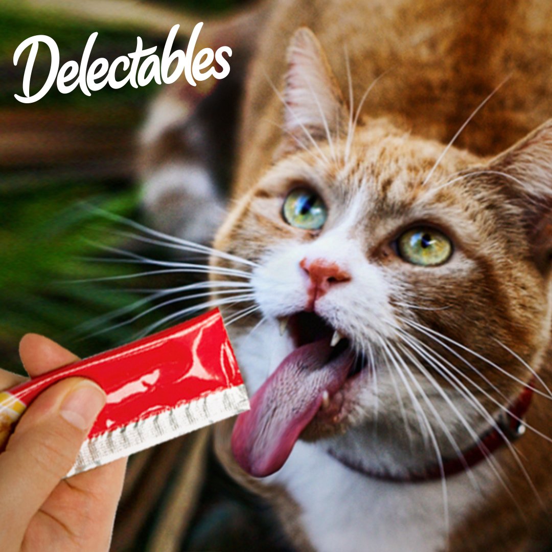
What you’re looking at is the most lickable cat treat on the market: Delectables Stew and Squeeze Ups. The most obvious goal as a brand in this category is to own the lick. We centered the spots around the product, both physically and verbally, using it as a comedic catalyst for exaggerated licking and mild confusion. The alliterative tagline and jingle was born out of the single most important action: LICKING!
Simultaneously, I took the lick as an opportunity to create a visual identity that looks as delicious (to a cat) as it sounds (to a cat). The brand’s already captivating red color and fluid logotype was a solid base to build from and create a system that elevates and expresses the tone of the brand – relatable and fun.
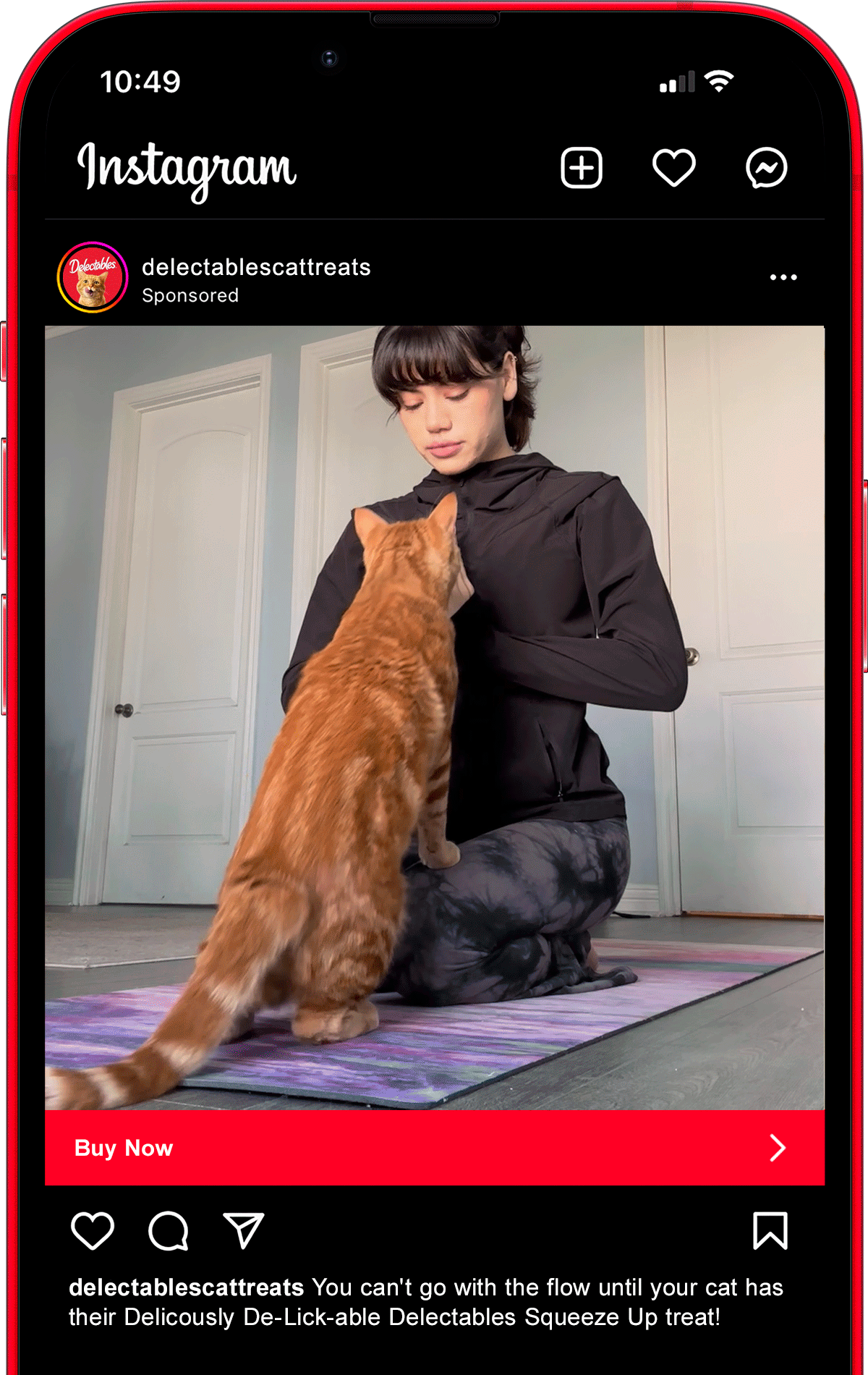
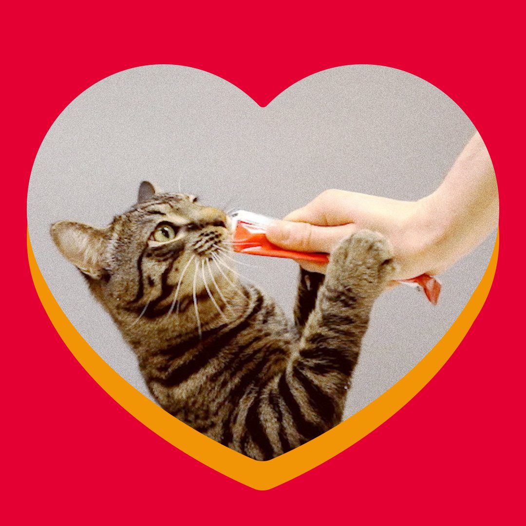
Fast forward two years, and the ask was to extend Triple D (as we call it internally) specifically for Squeeze Ups in a social-specific campaign. The challenge was to retain engagement by creating content that didn’t feel like an ad. Our idea was to create UGC-inspired videos that show cats performing highly intentional, borderline human behaviors to communicate with their owners exactly what they want. And when they want a Squeeze Up, you’ll know.
SQUEEZE UP SOCIAL CAMPAIGN
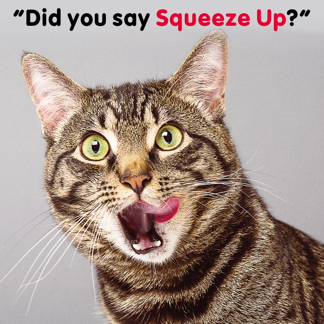
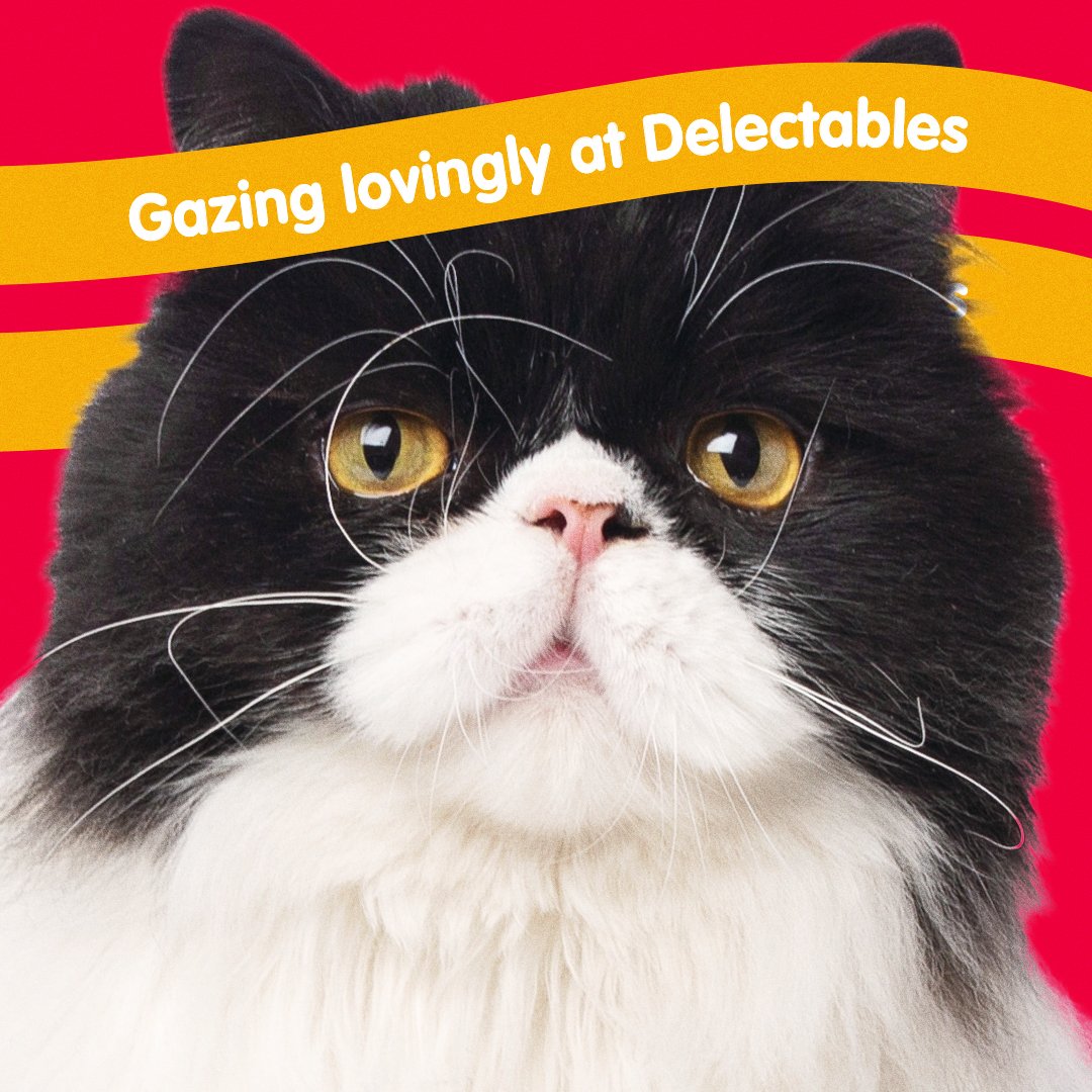
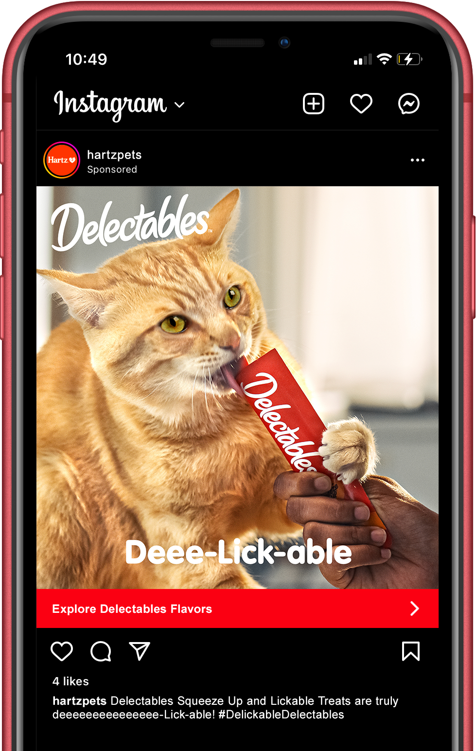
STATIC PAID SOCIAL POSTS
Some fun stills we pulled to use as static paid ads across IG & FB.


VISUAL IDENTITY

Photo Credit: Nils Jacobi
ALTERNATE BRANDMARKS

In cases the traditional white logotype has low legibility, I created a secondary version to contrast over light backgrounds. The thick stroke is juicy and fluid, just like the product.

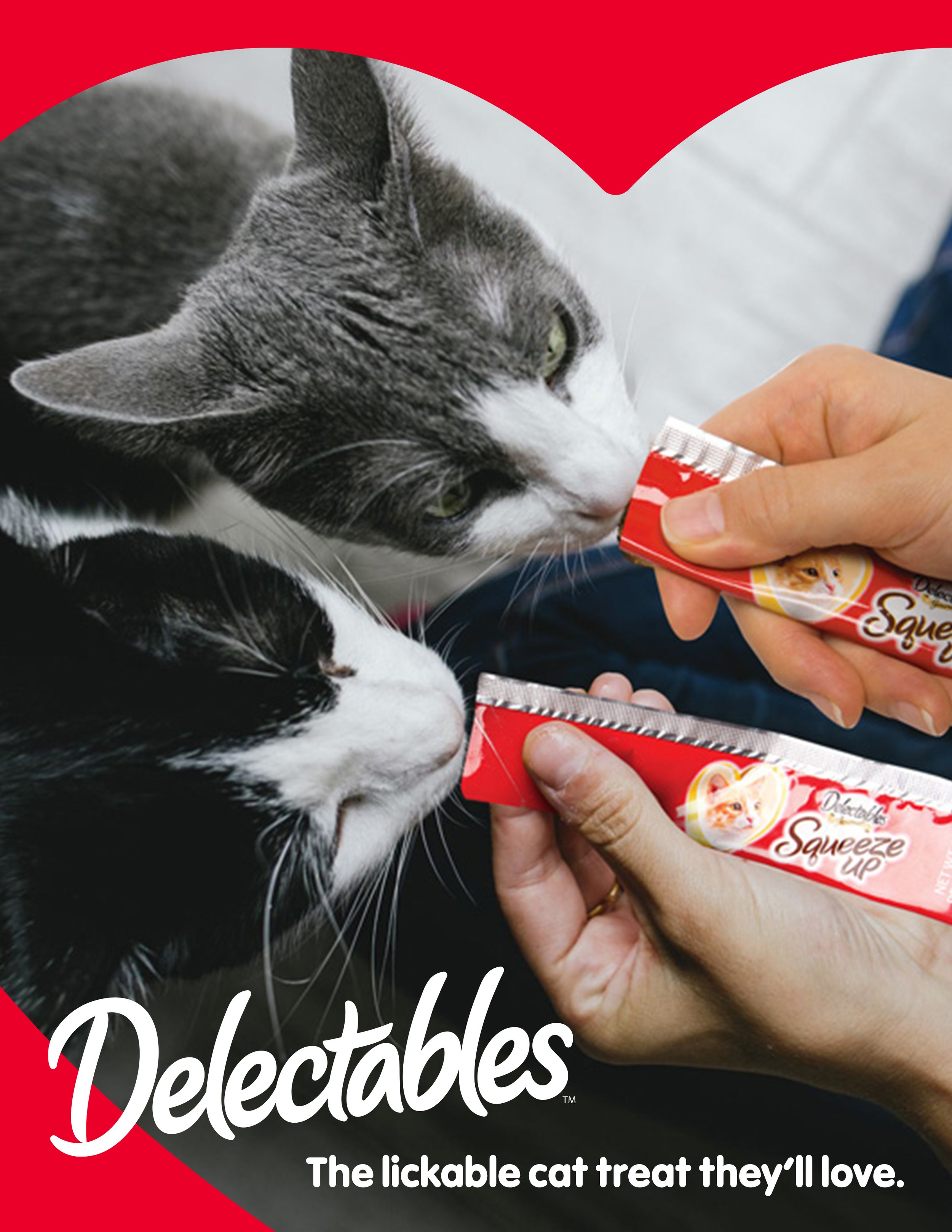
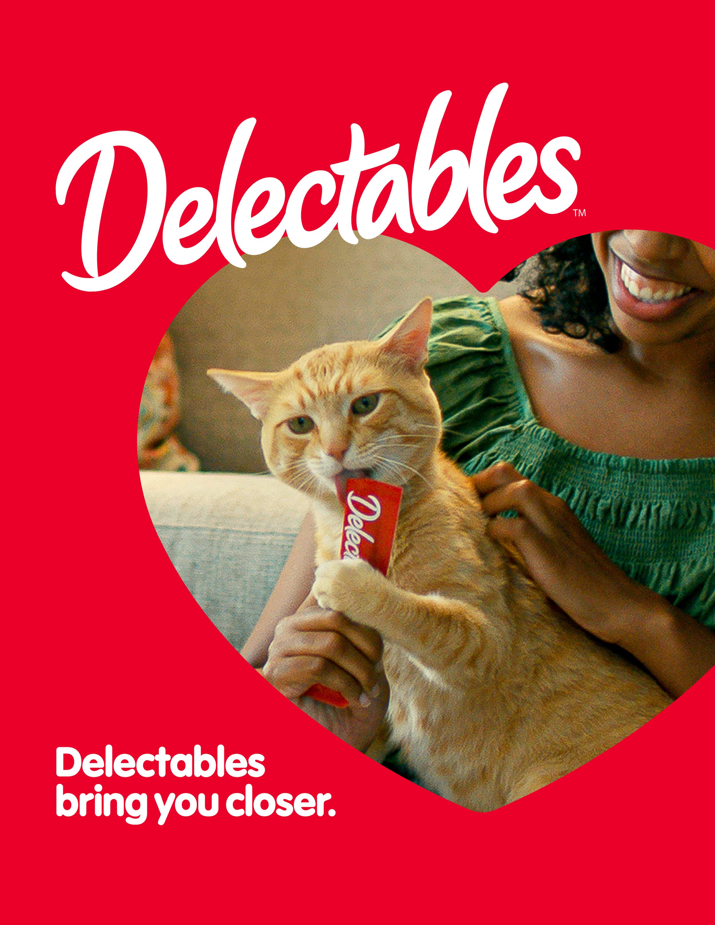
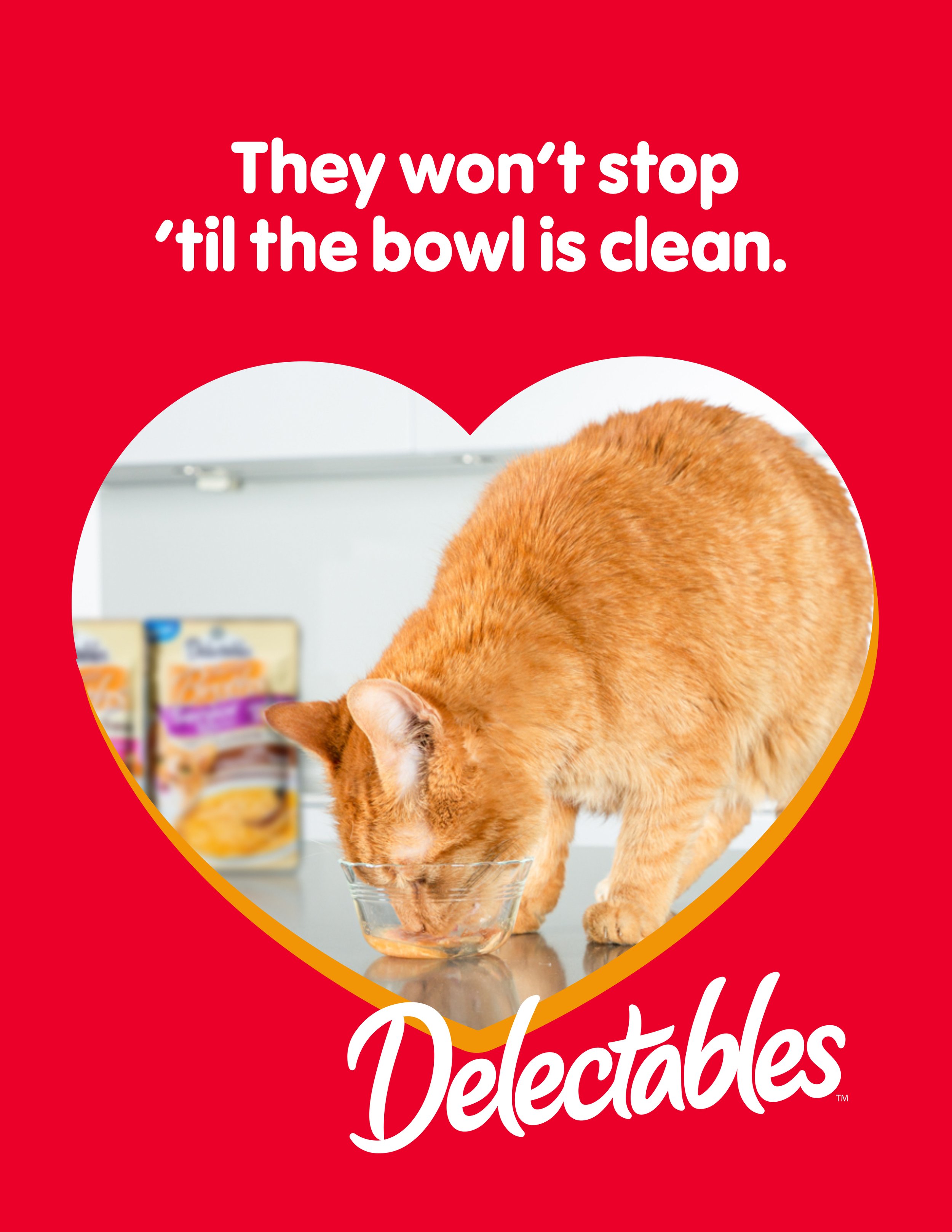
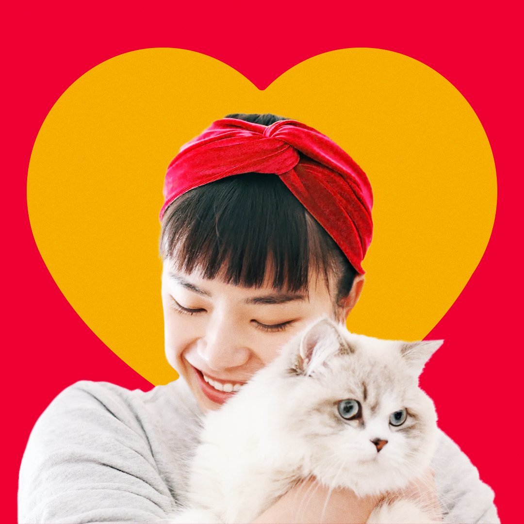
Hartz uses a heart as their distinctive brand element. It’s also a design element on the Delectables packaging. As an alternate version, I placed the logo within a heart to tie Delectables back to Hartz.
PHOTOGRAPHY STYLE
Unscripted. Authentic. Moments that look and feel natural. All with three categories in mind: cat personalities, cat & human interactions, and cat & product interactions.

ADCEPTS
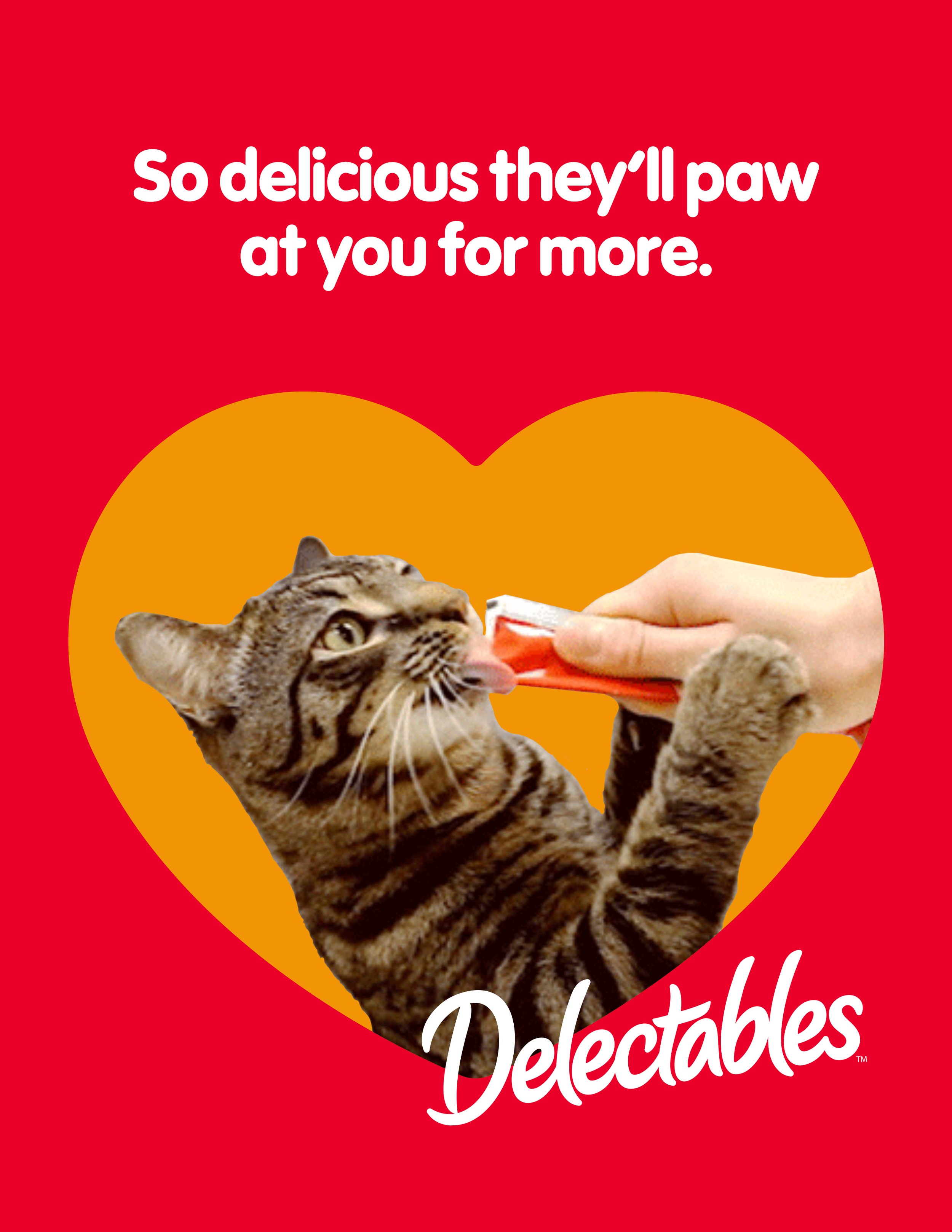
All of the elements from the visual identity come together to create memorable, impactful, and own-able pieces of communication.
Communication that ideally evokes a sense of connection between pet & owner, and pet & product.
SOCIAL DESIGN ELEMENTS
DDD PAID SOCIAL
These paid social posts were direct pulls from the DDD campagin spots, with the design falling out of the visual identity.


WEB BANNERS

Team
design lexi lanzi, hichem kherbachi // art direction lexi lanzi, alex ebright // copy taylor smith // creative direction adam vohlidka, scott padden // producer brian cooper // cco chuck mcbride
Press
Adobo Magazine / MediaPost / AdForum / Ad Ruby / Pet Food Industry / World Branding Forum / MediaBrief / Pet Food Processing / PETS+ / Brand Innovators / Branding in Asia / postPerspective / Pet Business / Reel 360 / Creativepool