NO MEAT ATHLETE
wellness over things
visual identity
No Meat Athlete is a curated content source for anyone curious about veganism from exercise and diet, to fully vegan athlete. Every year for Black Friday, they offer crazy bundles and discounts on featured resources for the entire week – Black Week.
In 2019, they wanted to take it further than just a discount. They named it Wellness Over Things, and needed someone to create a visual identity for all of their communications. Someone vegan. That’s me!
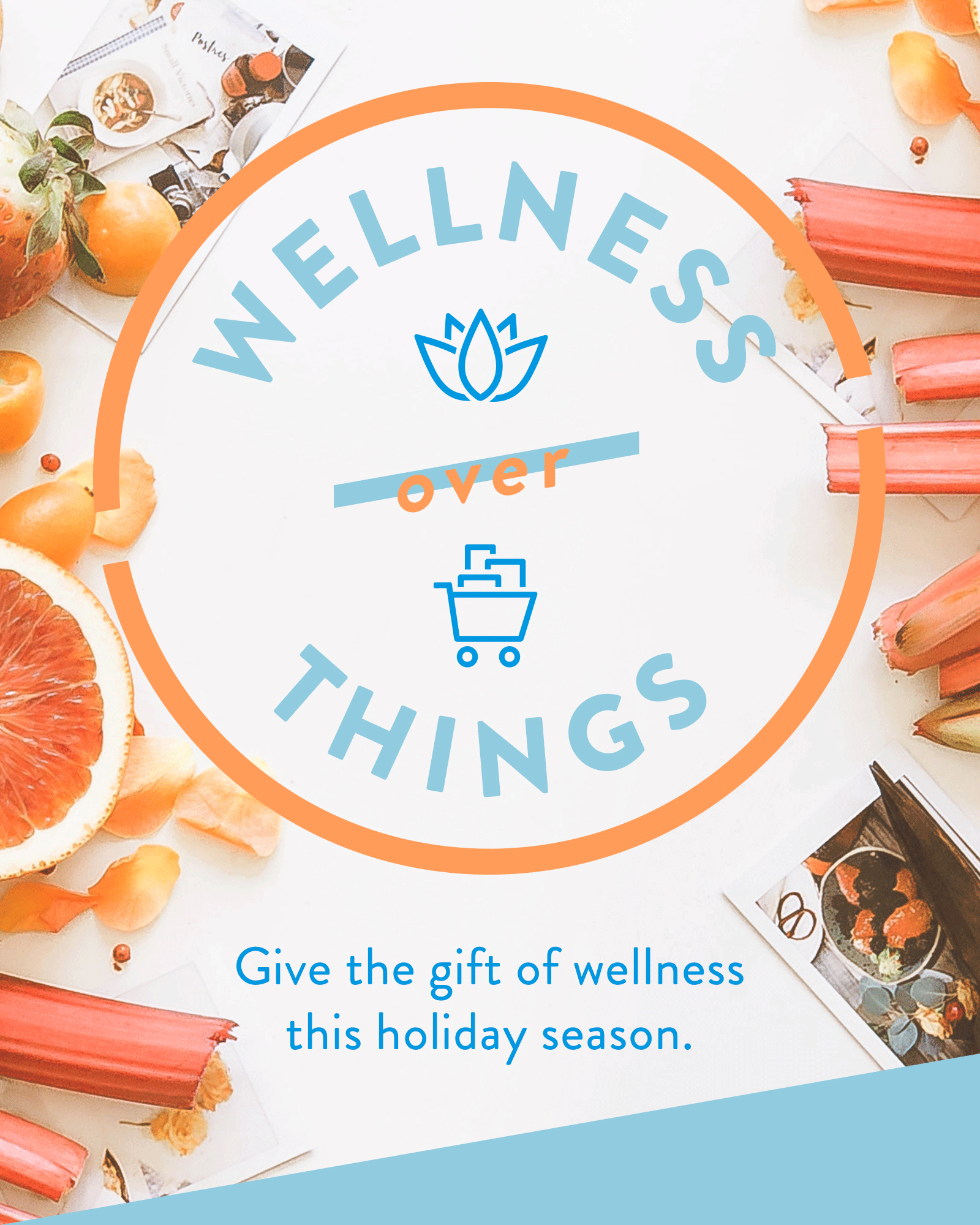
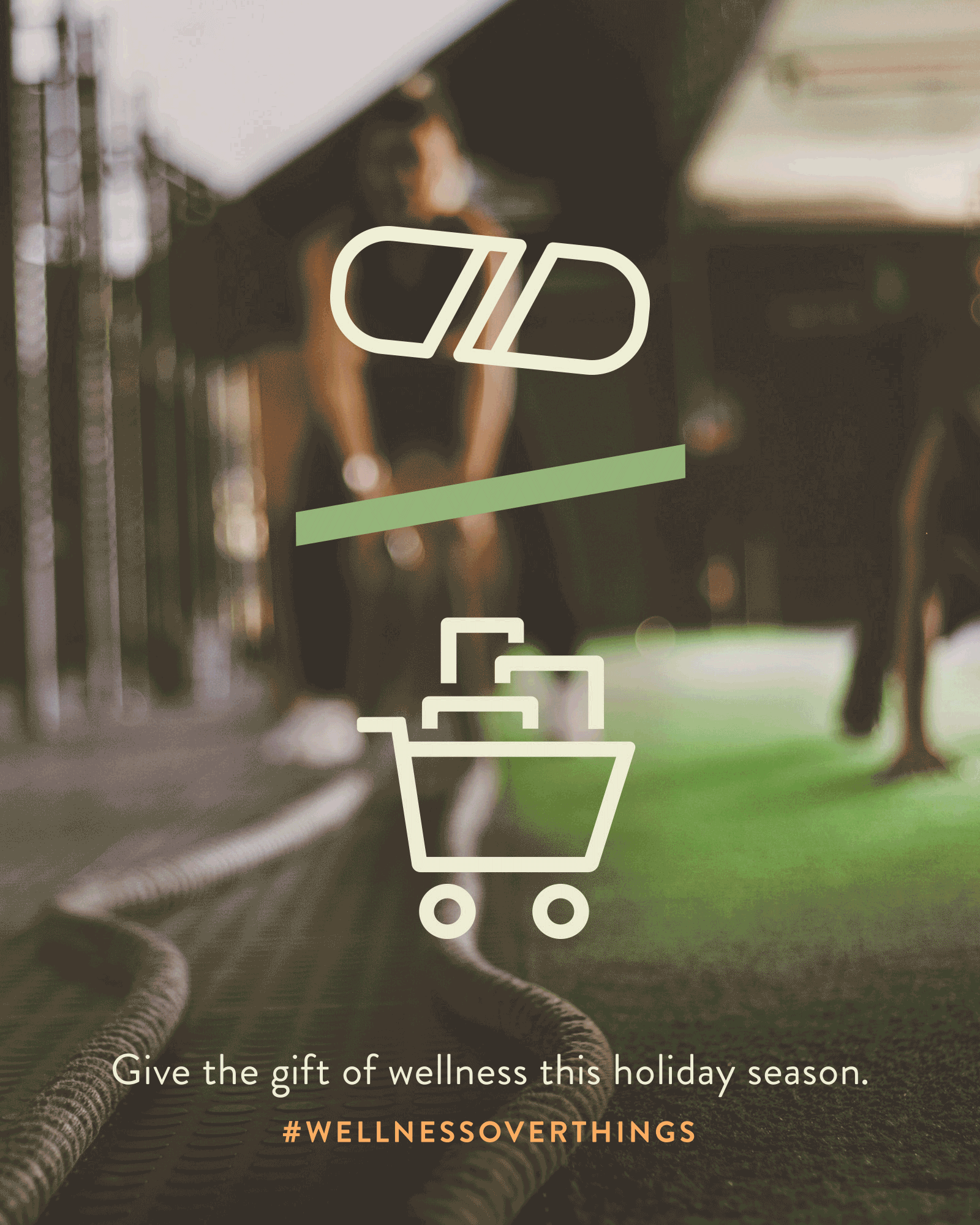
Wellness Over Things conveys to the consumer that investing in your health is more important than investing in material wealth. I created a logo, other lockups, and visual identity within their color palette. Using the No Meat Athlete logo (the carrot) as inspiration, I created an icon system to visually represent the idea of wellness over things that really comes to life in the animated GIFs for social.
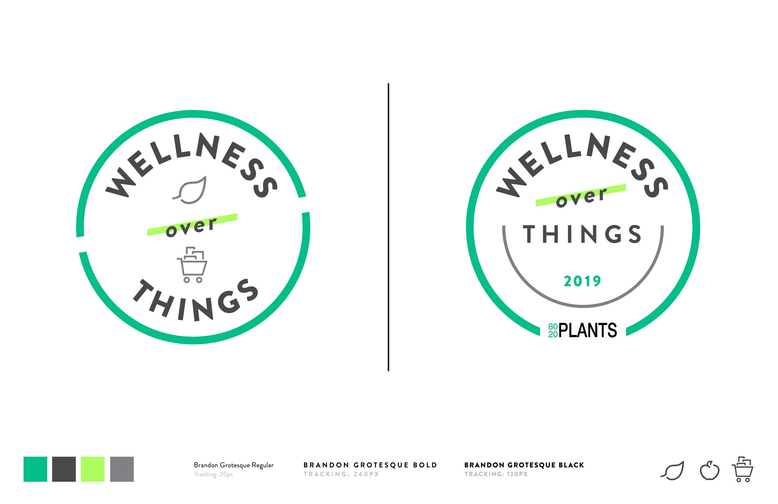
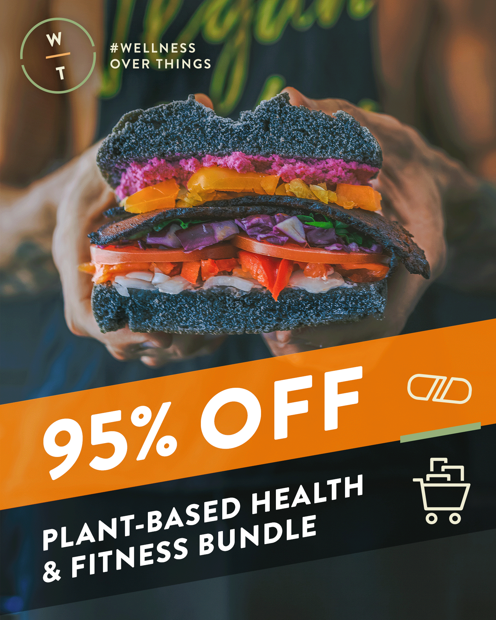
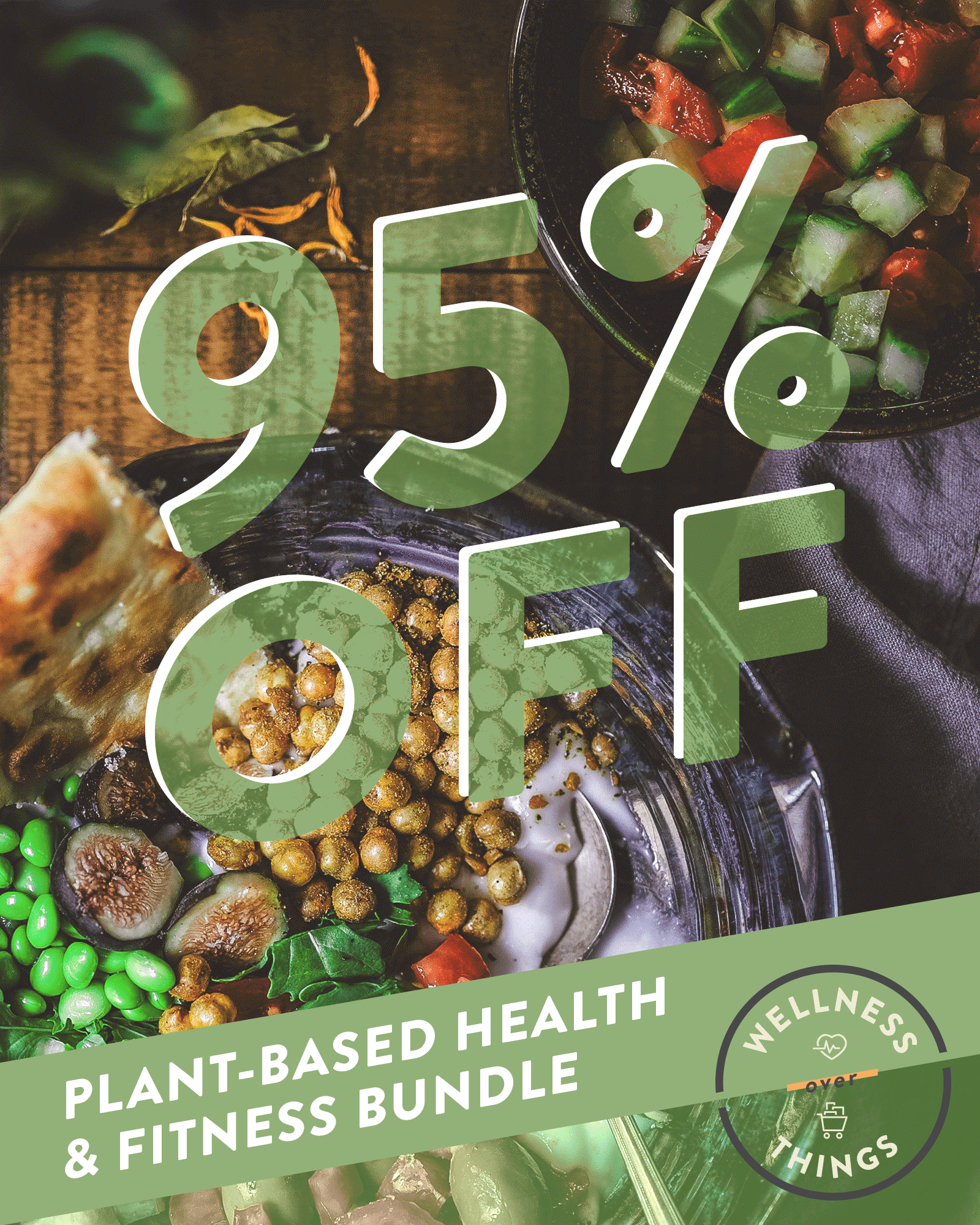
They loved it so much that they wanted their other brands, Complement and 80/20 Plants, to have the same visual identity for their own Black Week deals. To personalize the main logo, I switched up the top wellness icon to represent what each brand’s focus is.
design kit
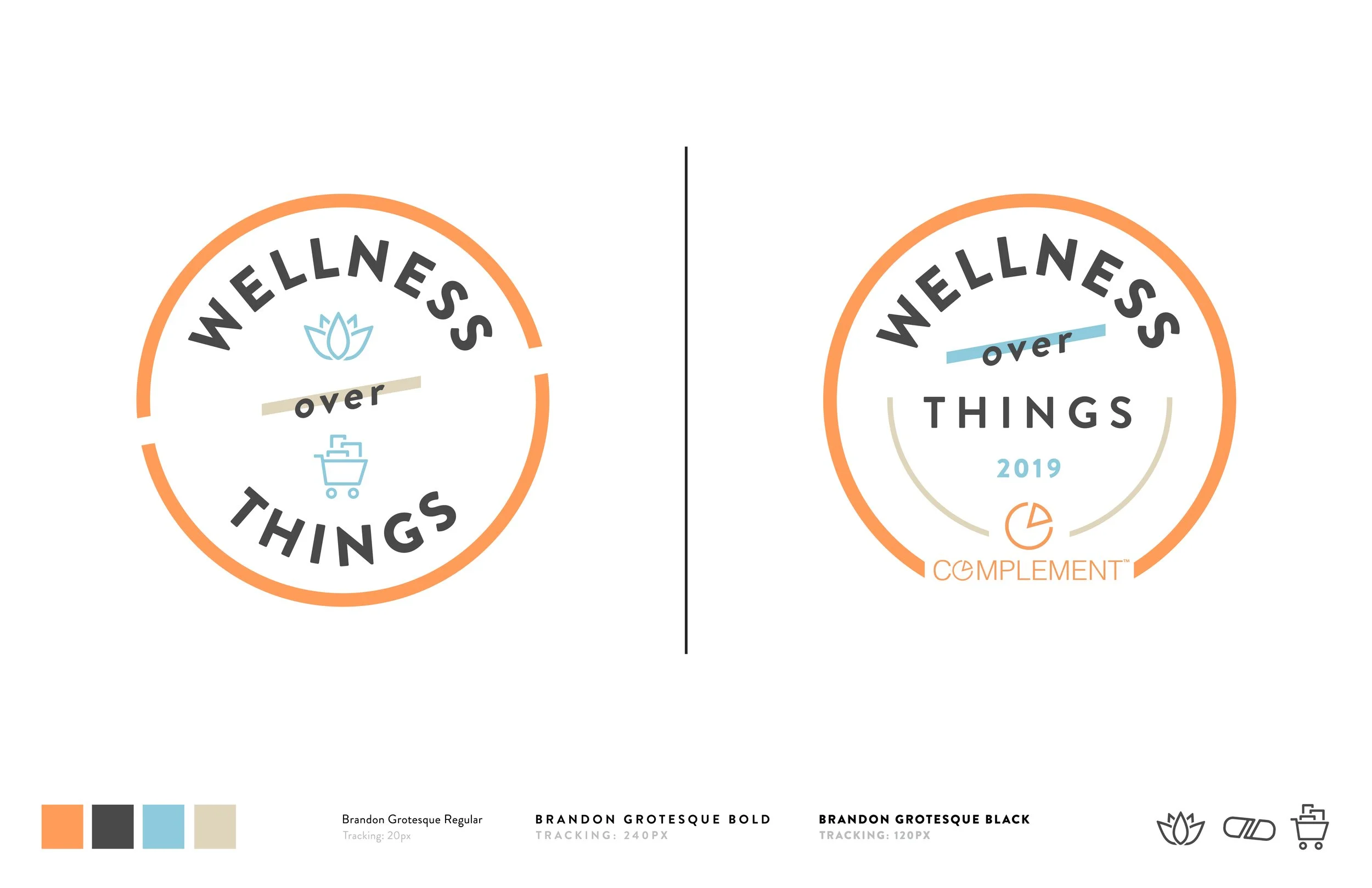
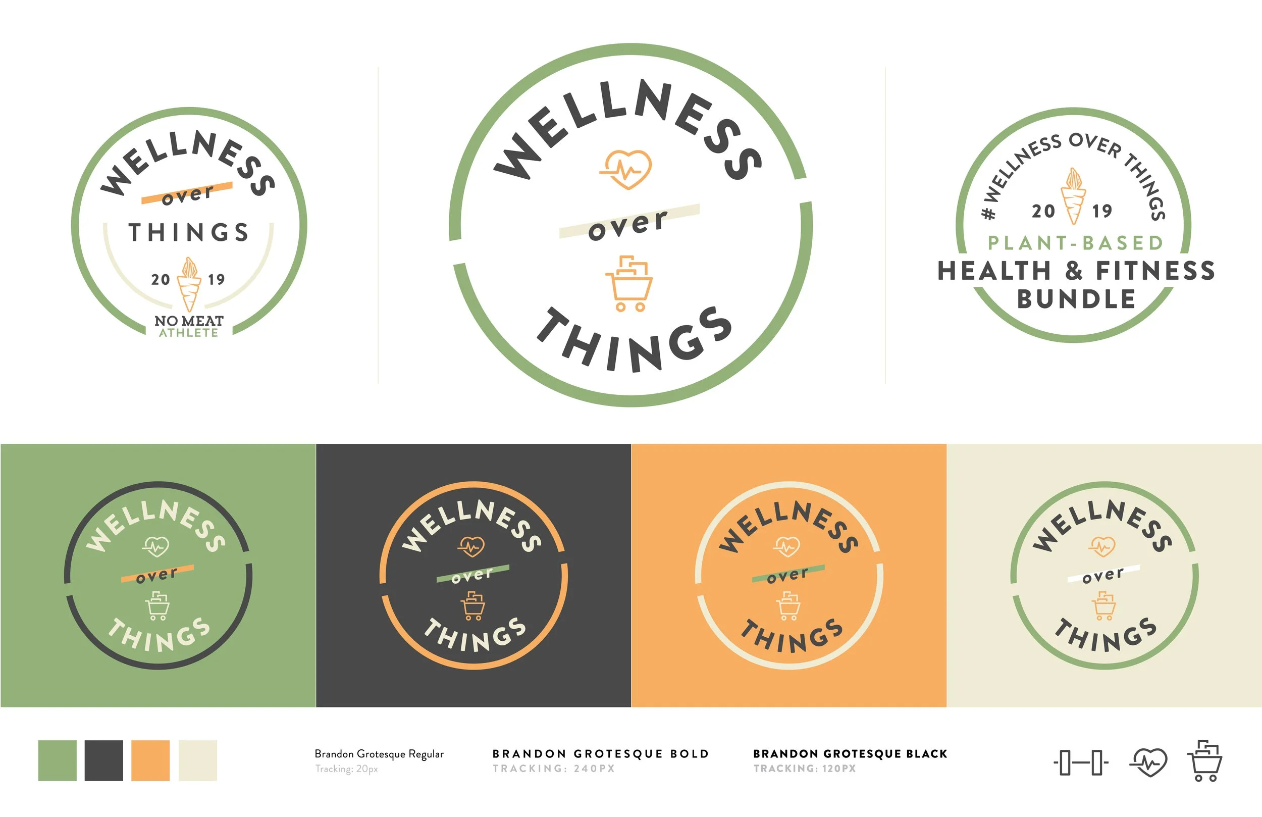
logo & variations
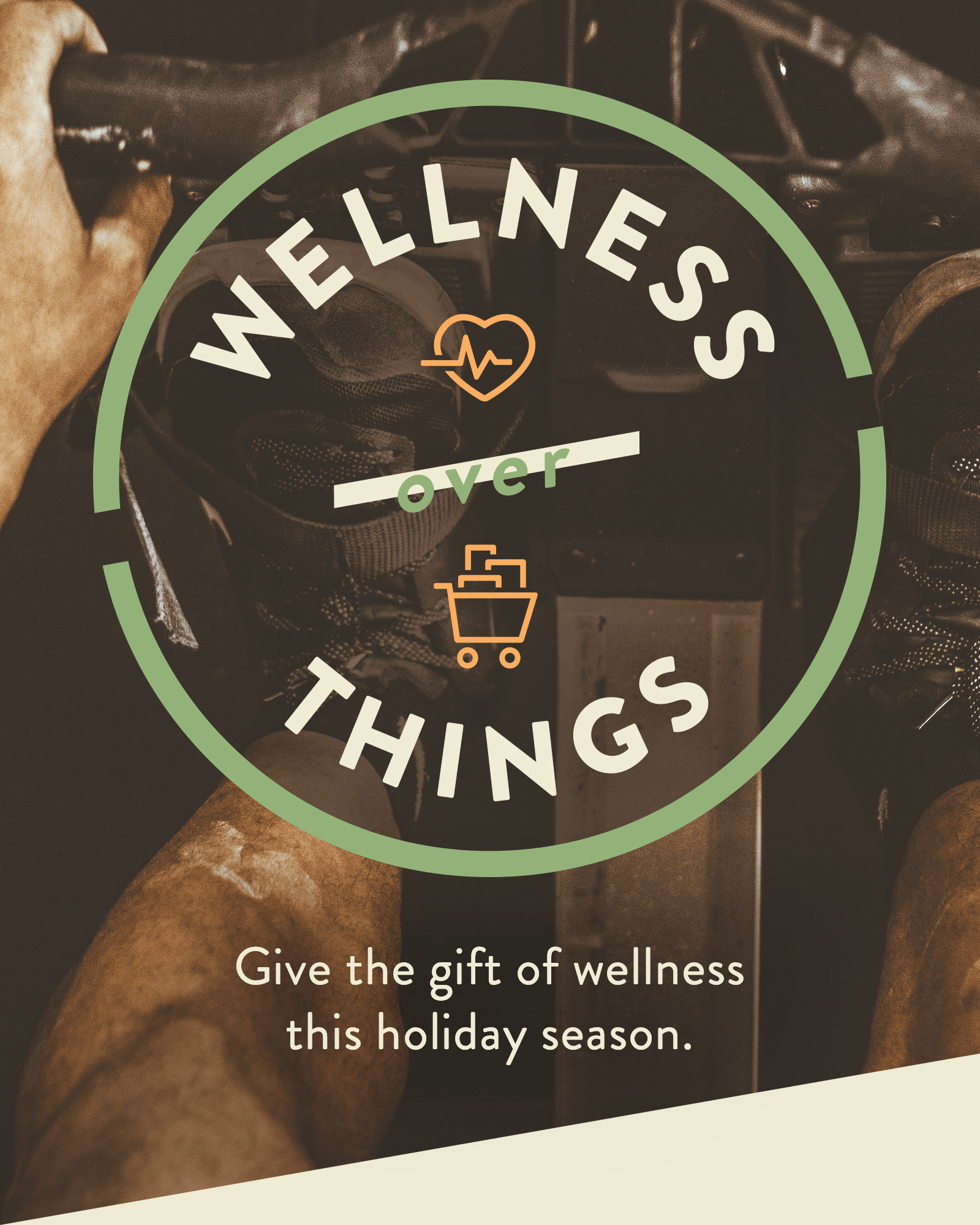
The primary logo is a seal that expresses wellness over things in two ways. One: it visually places the word “wellness” over “things,” with a dividing line between the two. Two: it serves as a device for a “wellness” icon to live above a “things” icon – which in this case, represents material items you would normally buy during Black Friday, hence the shopping cart.
The secondary logos each serve a different purpose - the left is more overarching of the program name and sponsor, the right is more explicit about what the program entails.
The color variations show that it works across many colors, from dark to light.

additional lockups & icons
The kit also provides a bunch of other fun lockups, icons, and typeset taglines to use across communications – some a bit heavier than others.
When there is space for the lockup to exist in a larger format with time for the viewer to absorb all the info, the top variations communicate all the key points of the program. Beneath that lives an extremely simplified logo seal that turns it into an icon.
There are also different variations of the icon system working within the simplified logo seal. These are also locked up with the tagline as left-, center- or right-aligned options.
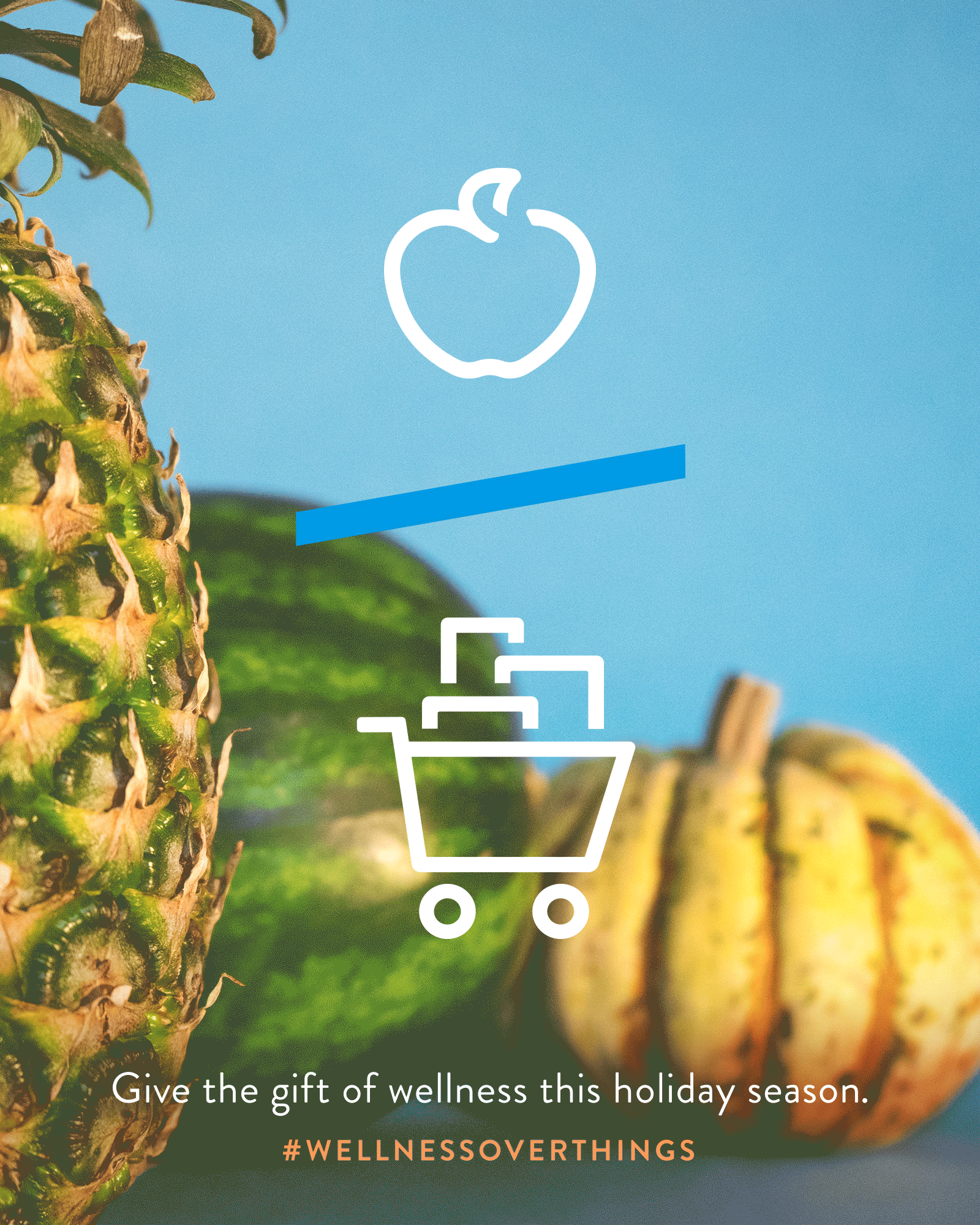
how it comes to life
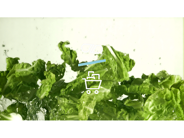
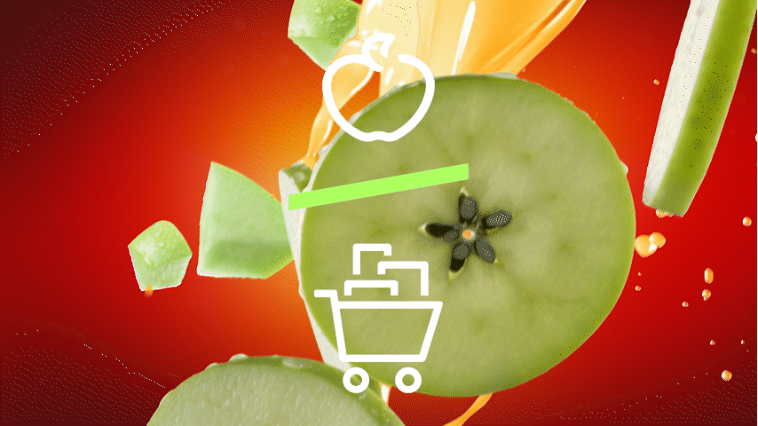
paid social ads
When all these pieces come together, they create bold, eye-catching pieces of communication, especially as GIFs. It puts the icon system to use in a way that makes sense: that there are better things to gift than material objects. The diagonals within the design kit are also meant to be put to use to create dynamic fun shapes that help scream “SAAAALLLEE!”
how the system works for Complement vegan supplements